
Year
2025
Deliverables
Brand Strategy Idenity UI/UX Design Framer Development
Brand identity and website design for M1 Capital, an Amsterdam-based digital asset hedge fund built around market-neutral strategies, investor trust and a new era of digital finance.


The Challenge
Turning complexity into trust
M1 Capital needed a website that could explain technical digital asset strategies without overwhelming investors. The challenge was to create a finance-focused redesign that felt institutional, clear and conversion-driven.
The Solution
A clear digital platform for investors
We created a refined website experience with structured content, strong hierarchy and a premium visual system. The result is a modern finance website that communicates trust, performance and expertise in digital asset investing.

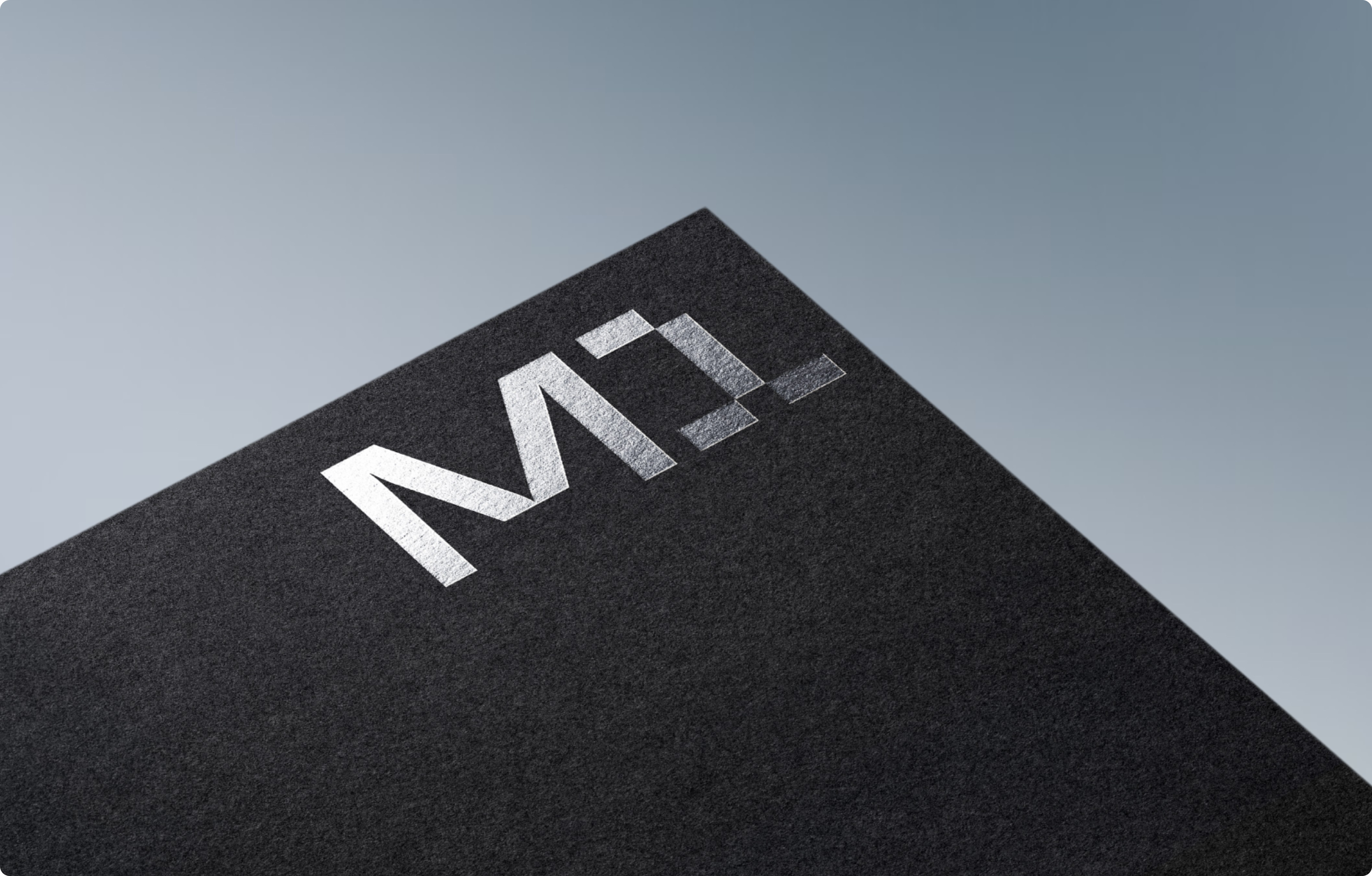
Logotype
The M1 logotype is built from sharp geometric forms — a structured mark derived from grid logic and circular geometry.


Stationery
From embossed letterheads to invoice systems, every touchpoint was designed with the same rigour.


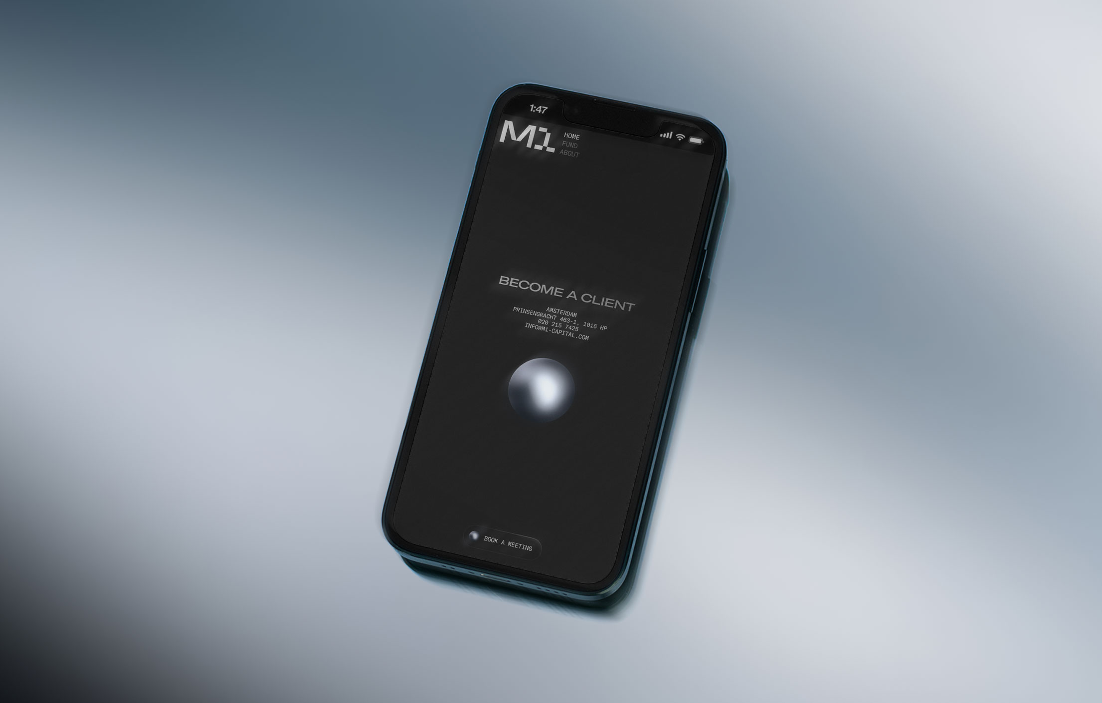
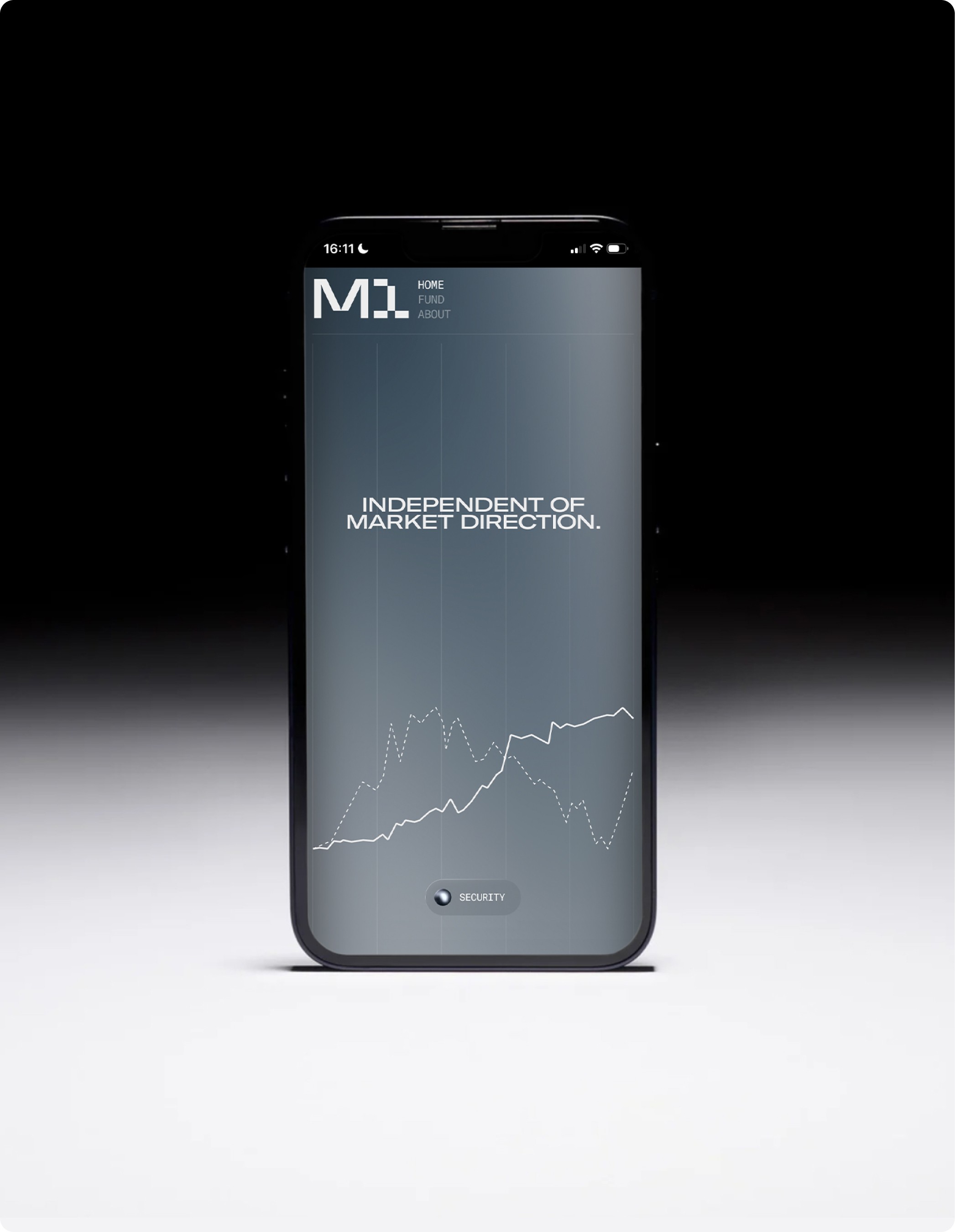
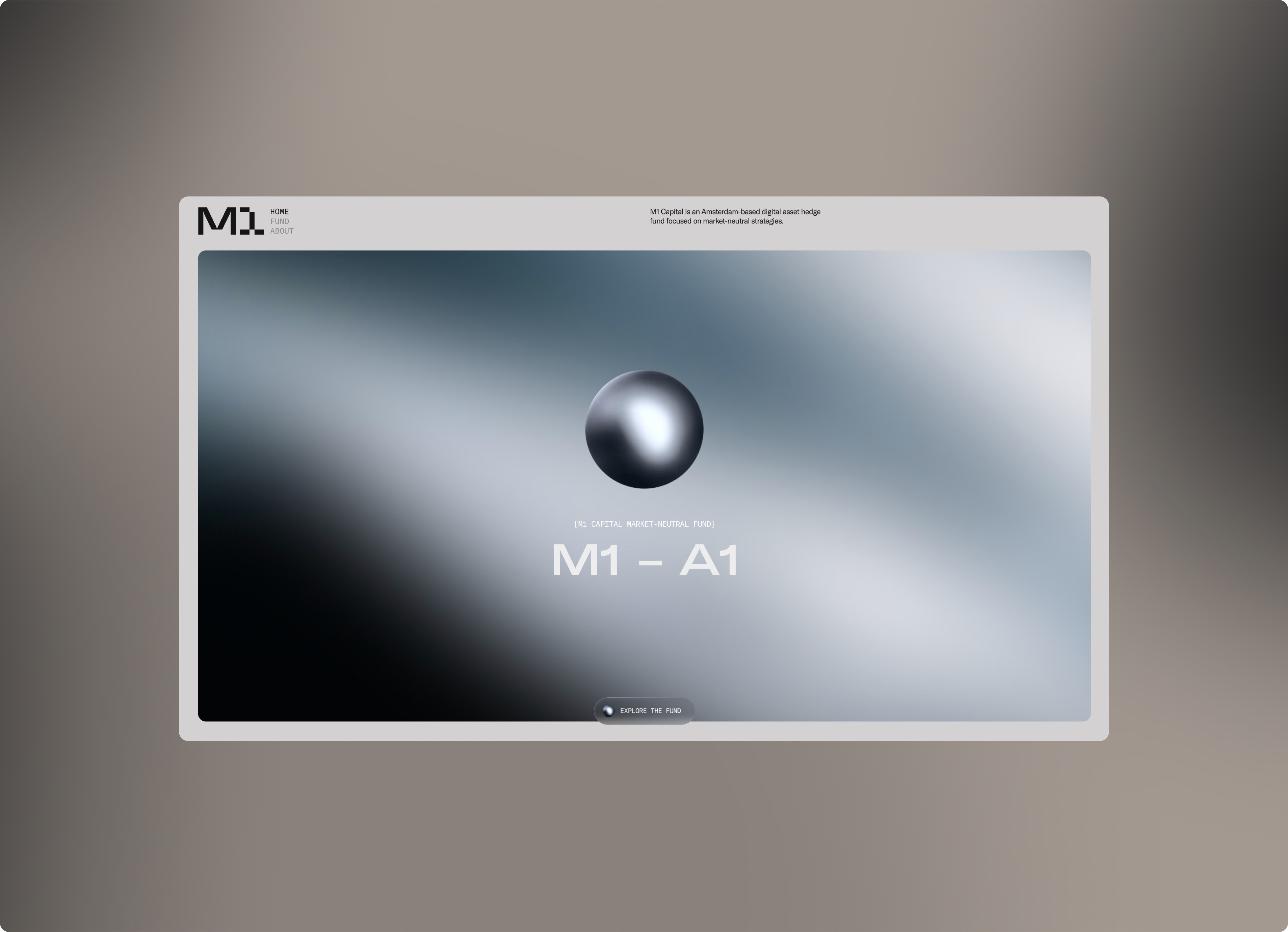
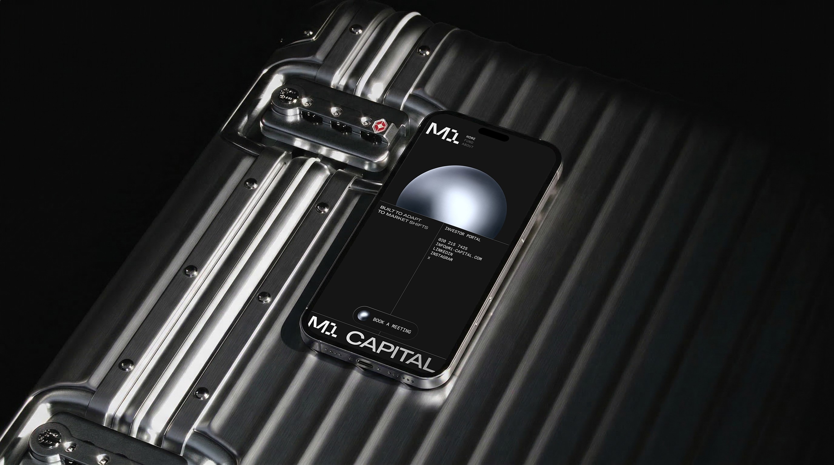
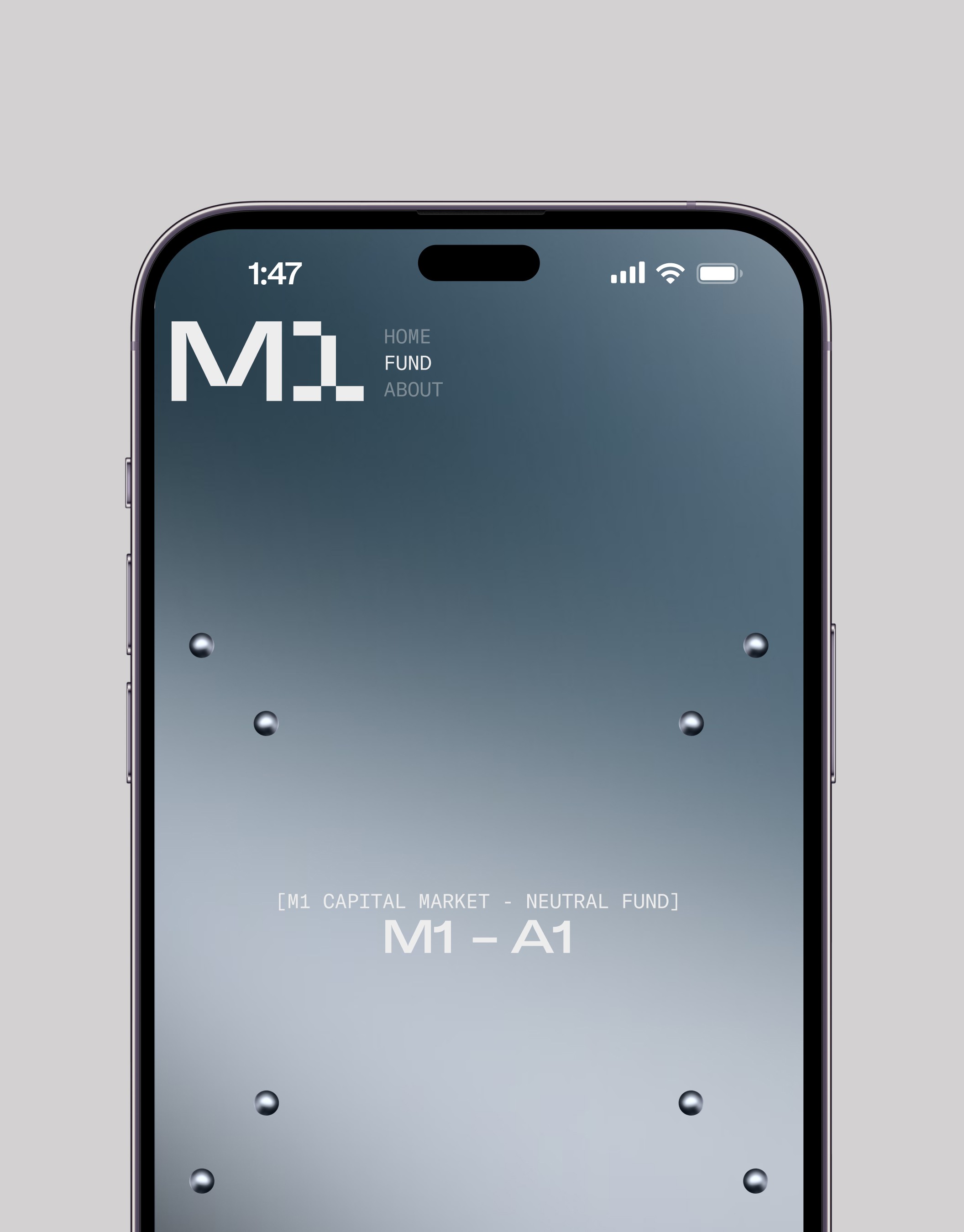
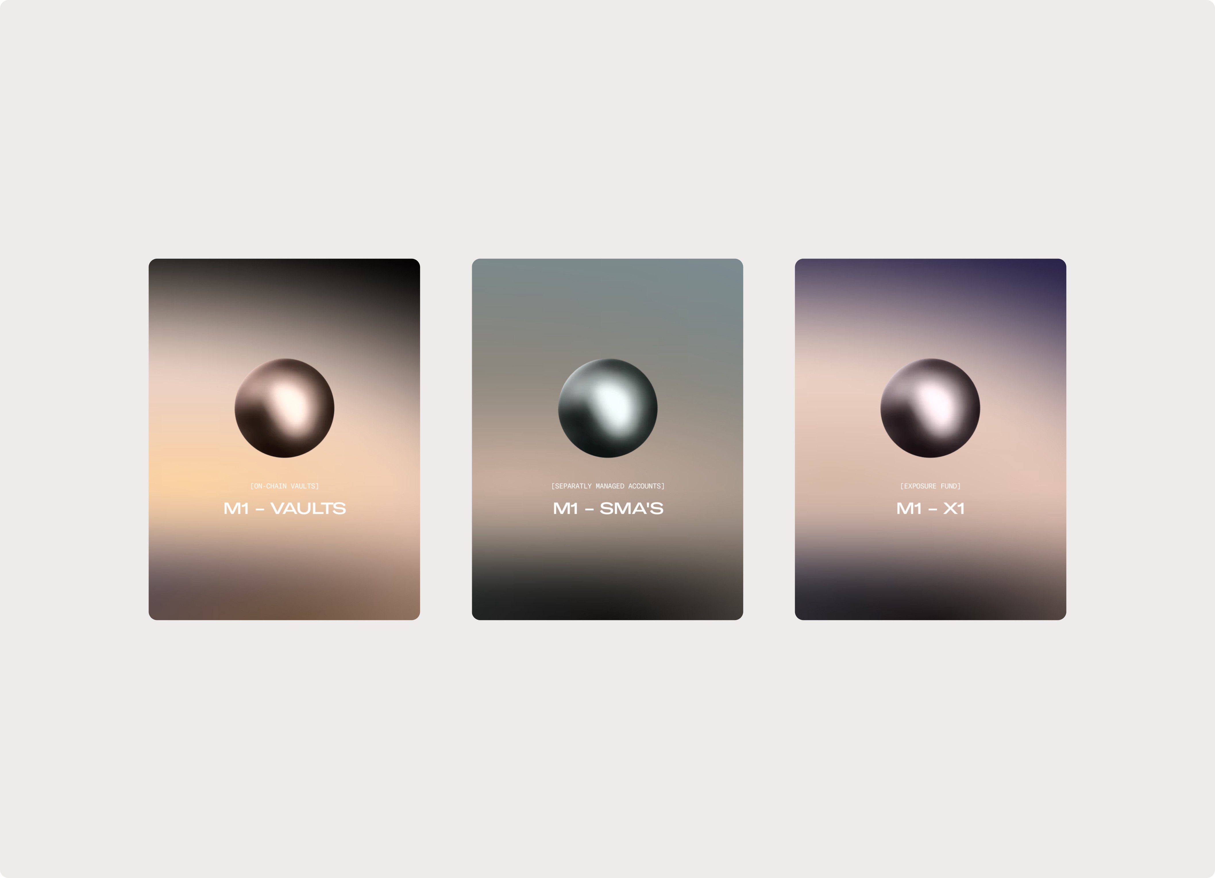
Website
Built for a specific kind of investor, it communicates through restraint. Dark surfaces, liquid gradients, and a single animated sphere replace the usual pitch deck language.

One visual language. Every format, every surface, every scale.

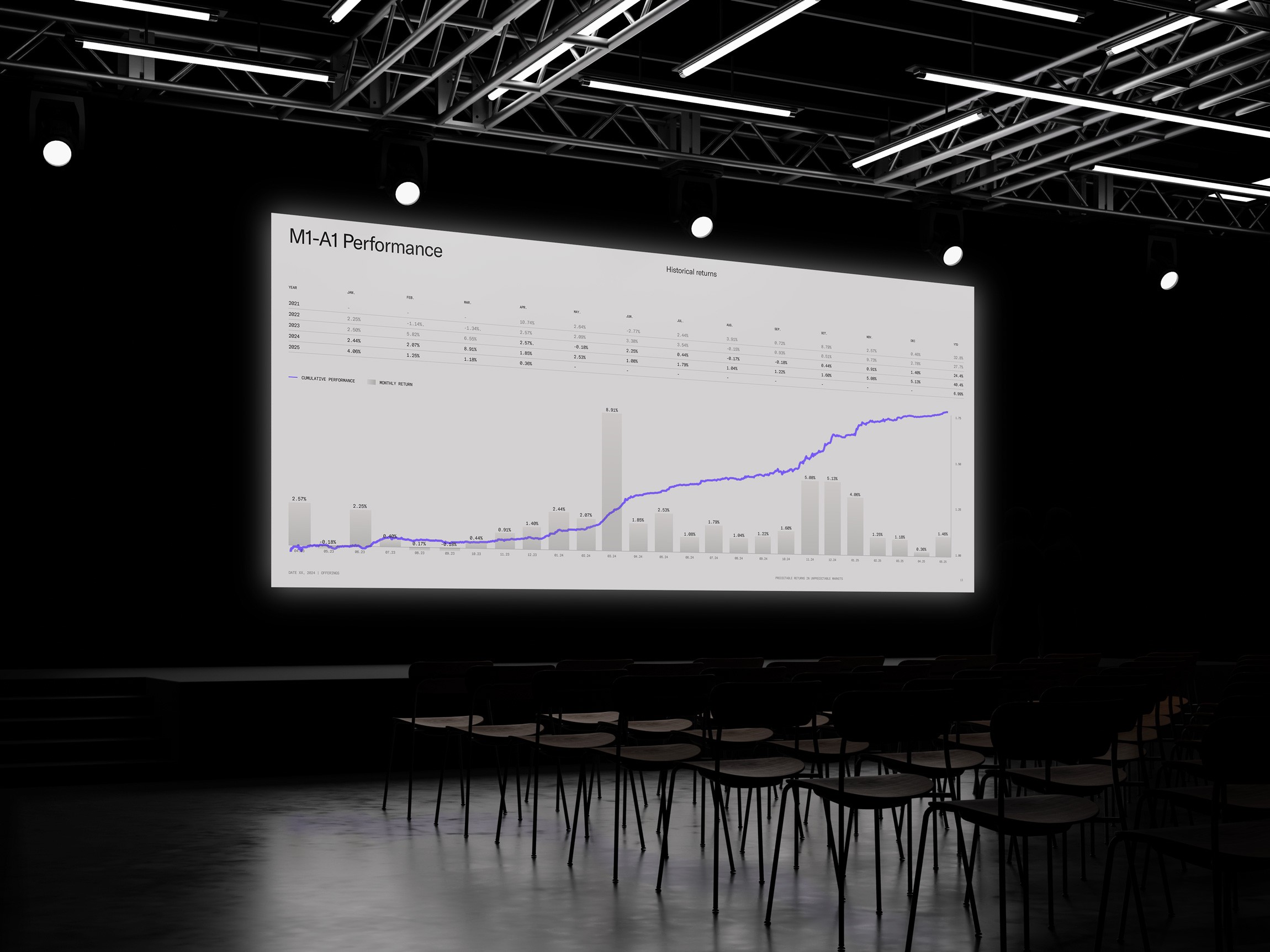
Data System
The numbers don't need decoration. YTD returns, annualised performance, positive months, and a Sharpe ratio of 4.0 — each metric is set in mono type, sized for impact, and spaced to breathe.

Team
Julian Mollema
Ralph Tilon
Lorenzo Bertozzi
Daria Lareshko
Project Information
M1 Capital is an Amsterdam-based digital asset hedge fund focused on market-neutral investment strategies. Operating at the intersection of finance, technology and digital assets, the firm needed a brand and website that could communicate trust in a market often defined by volatility, complexity and hype.
Analogue created a refined identity and digital platform built around clarity, control and confidence. Instead of leaning into typical crypto visuals, the design uses dark surfaces, liquid gradients, precise typography and structured data moments to create a more institutional feel. The result is a calm and credible finance website that makes complex fund information easier to understand for investors.
The new platform gives M1 Capital a stronger foundation for presenting its funds, strategy solutions and performance-driven approach. From the visual identity to the website experience, every element was designed to support investor confidence and position the brand as a serious player in digital asset finance.


Year
2025
Deliverables
Brand Strategy Idenity UI/UX Design Framer Development
Brand identity and website design for M1 Capital, an Amsterdam-based digital asset hedge fund built around market-neutral strategies, investor trust and a new era of digital finance.
The Challenge
Turning complexity into trust
M1 Capital needed a website that could explain technical digital asset strategies without overwhelming investors. The challenge was to create a finance-focused redesign that felt institutional, clear and conversion-driven.
The Solution
A clear digital platform for investors
We created a refined website experience with structured content, strong hierarchy and a premium visual system. The result is a modern finance website that communicates trust, performance and expertise in digital asset investing.
Logotype
The M1 logotype is built from sharp geometric forms — a structured mark derived from grid logic and circular geometry.
Stationery
From embossed letterheads to invoice systems, every touchpoint was designed with the same rigour.
Website
Built for a specific kind of investor, it communicates through restraint. Dark surfaces, liquid gradients, and a single animated sphere replace the usual pitch deck language.
One visual language. Every format, every surface, every scale.
Data System
The numbers don't need decoration. YTD returns, annualised performance, positive months, and a Sharpe ratio of 4.0 — each metric is set in mono type, sized for impact, and spaced to breathe.
Team
Julian Mollema
Ralph Tilon
Lorenzo Bertozzi
Daria Lareshko
Project Information
M1 Capital is an Amsterdam-based digital asset hedge fund focused on market-neutral investment strategies. Operating at the intersection of finance, technology and digital assets, the firm needed a brand and website that could communicate trust in a market often defined by volatility, complexity and hype.
Analogue created a refined identity and digital platform built around clarity, control and confidence. Instead of leaning into typical crypto visuals, the design uses dark surfaces, liquid gradients, precise typography and structured data moments to create a more institutional feel. The result is a calm and credible finance website that makes complex fund information easier to understand for investors.
The new platform gives M1 Capital a stronger foundation for presenting its funds, strategy solutions and performance-driven approach. From the visual identity to the website experience, every element was designed to support investor confidence and position the brand as a serious player in digital asset finance.