Year
2025
Deliverables
UI/UX design 3D renders Art direction Motion Design
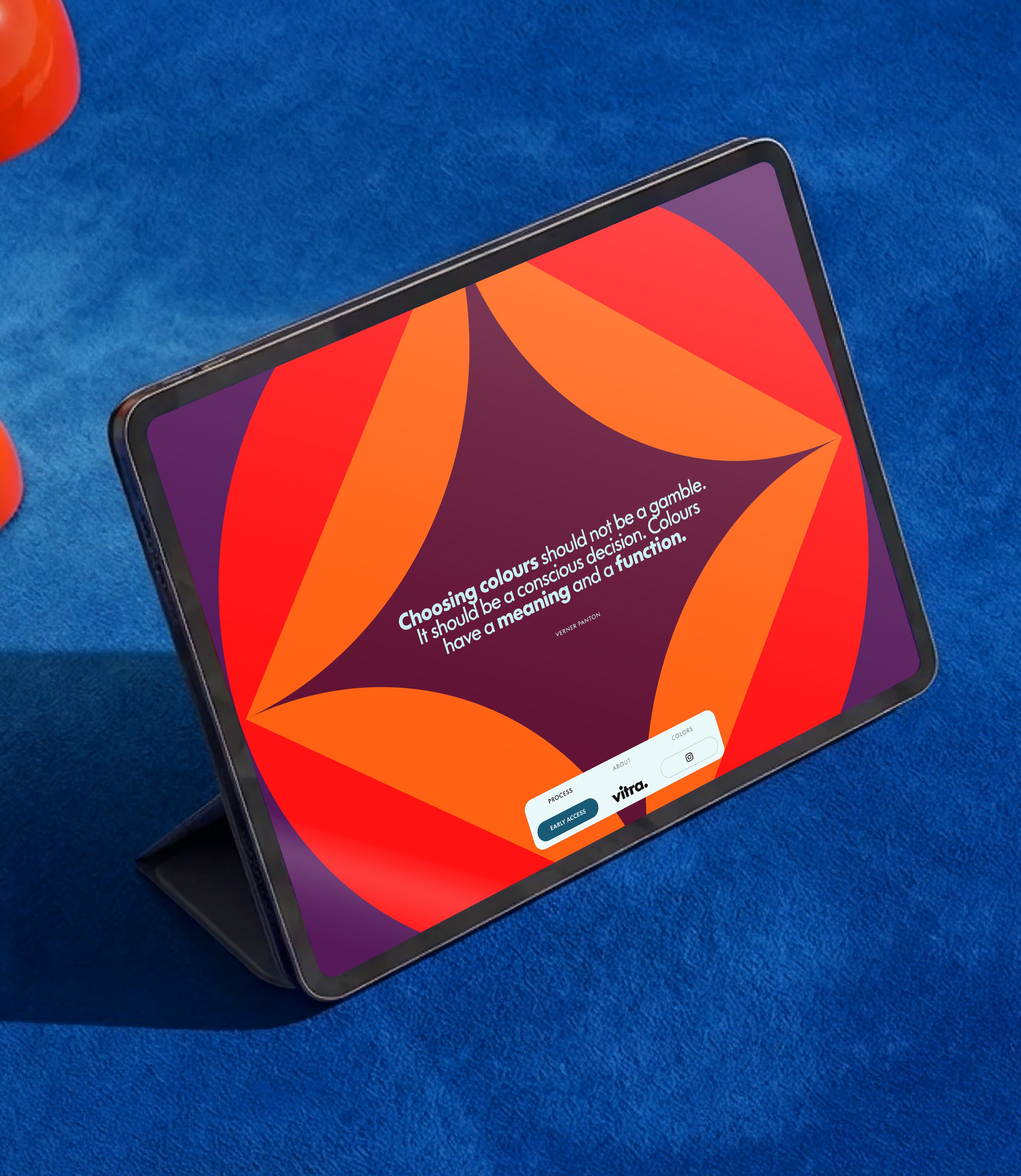
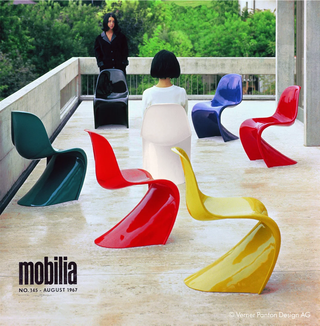
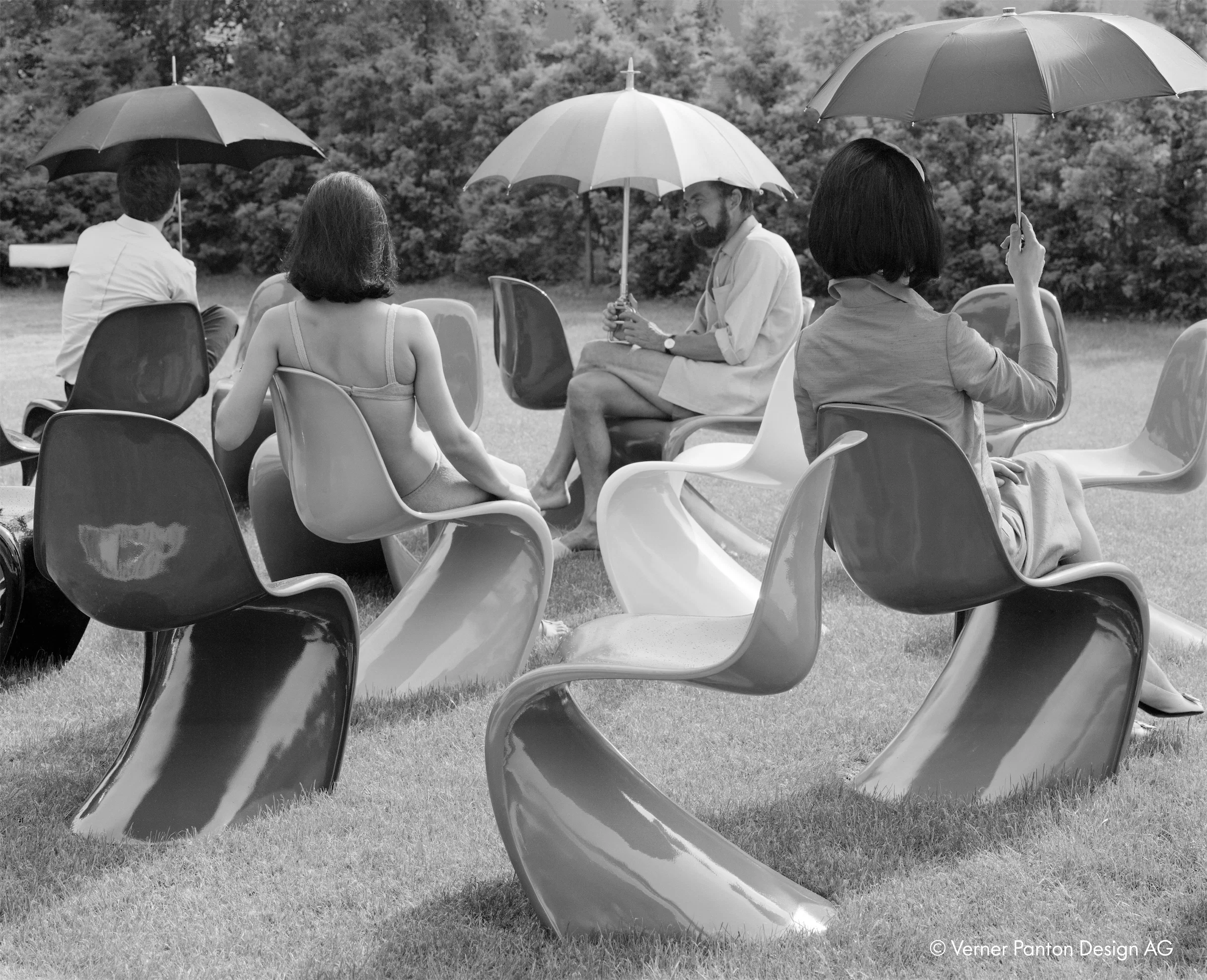
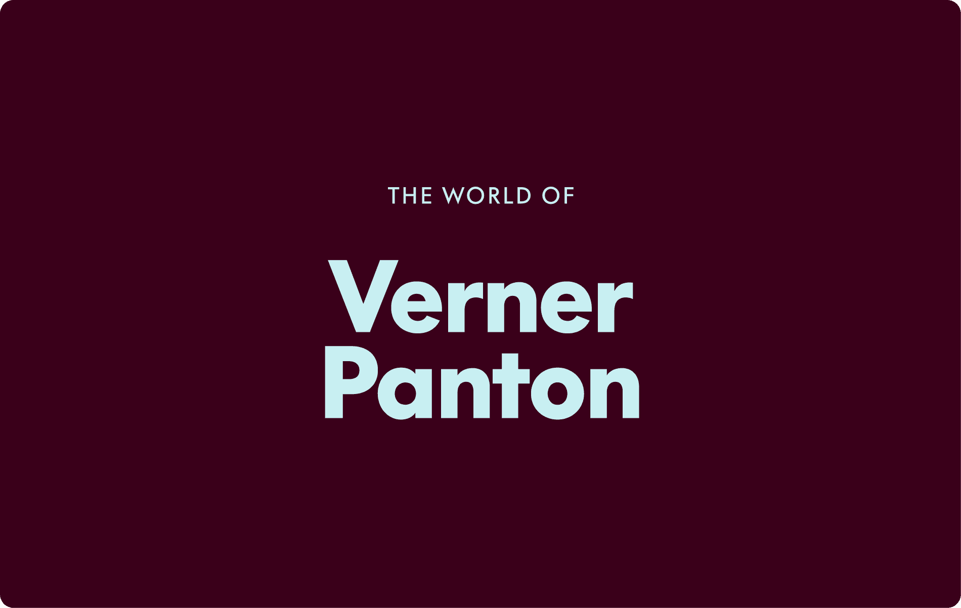
Vitra Panton: 100 years of Verner Panton. A digital ode to the master of color. Every pixel is placed to be functional, intuitive, and thrilling to scroll through.
Verner Panton didn’t just design furniture; he designed the future. For his centenary, we didn’t want to build a static archive. We wanted to build a digital ecosystem that felt as radical today as his cantilevered curves did in 1967.
An immersive experience where bold colors, fluid forms, and visionary design come to life.
The Experience: a journey that unfolds as you scroll


Cards
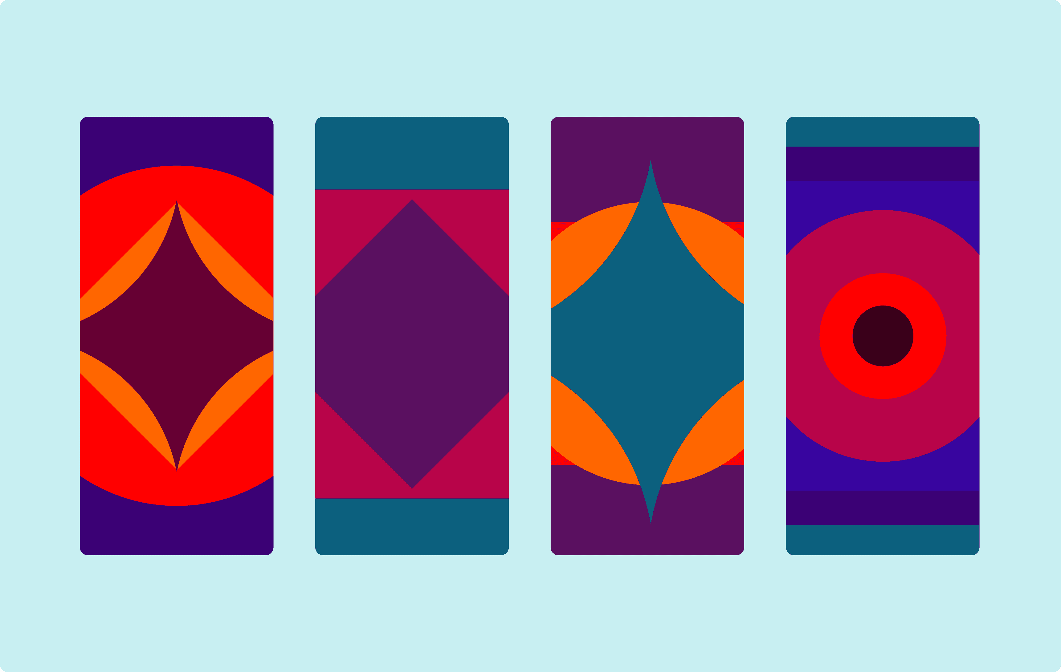
Not a catalog, but a gateway. Choose one card and you enter its world, where color defines the atmosphere and form becomes identity.
An invite to the world of Panton
Step into a dimension shaped by Verner Panton’s vision, where color leads and space follows.
Worlds
Seven immersive spaces built from Panton’s iconic curves. His fluid forms expand beyond the chair, shaping environments you don’t just view, you move through.
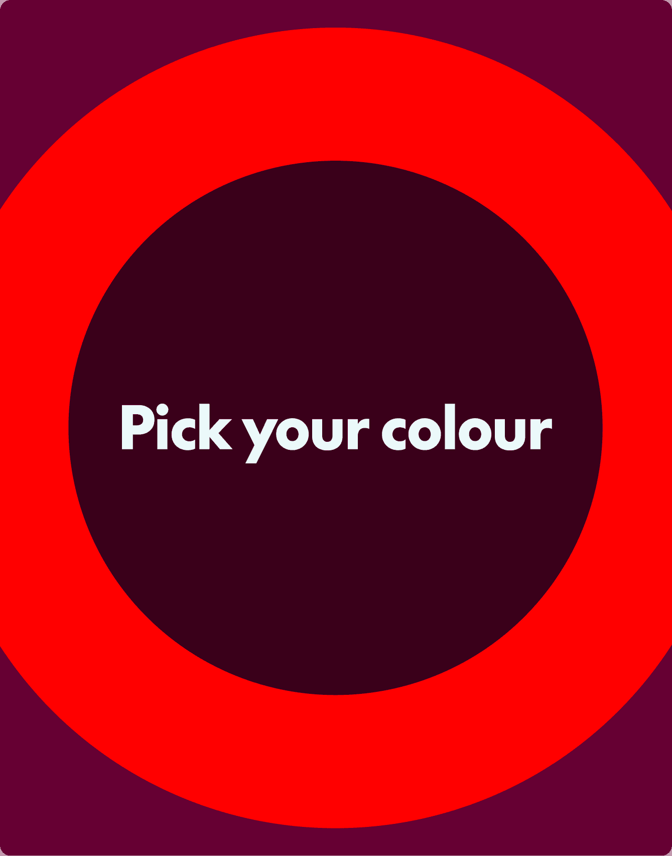
Scoreboard
We let the community decide the colors for the Limited Edition 2026. This isn't data collection; it's co-creation.
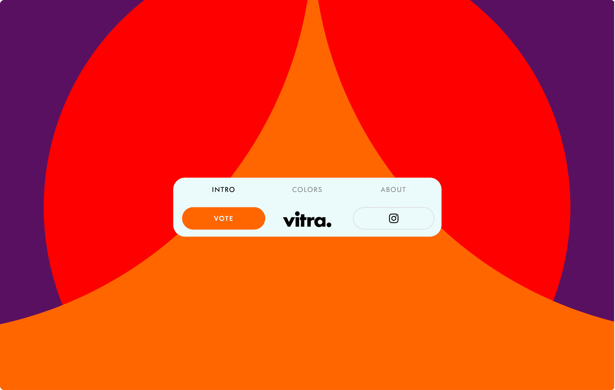
A flexible website that evolves with your needs.
Playful Animations
The Animation Style
Forms that flow like liquid plastic. We built transitions that feel less like loading and more like melting.
Playful Animations
Based on essential shapes, forms evolve into distinctive geometries through recombination.


The UI: a unique identity
A reflection on Panton’s language. Bold colors, fluid shapes, and modular elements create a system with a strong, recognizable identity.
The Spectrum
A reverence for red, blue, and the spaces in between. We didn't just pick colors; we calibrated a mood.

Color palette
Seven original Pantone codes define the core palette. Soft light blue and deep burgundy tones add breathing space without breaking cohesion.
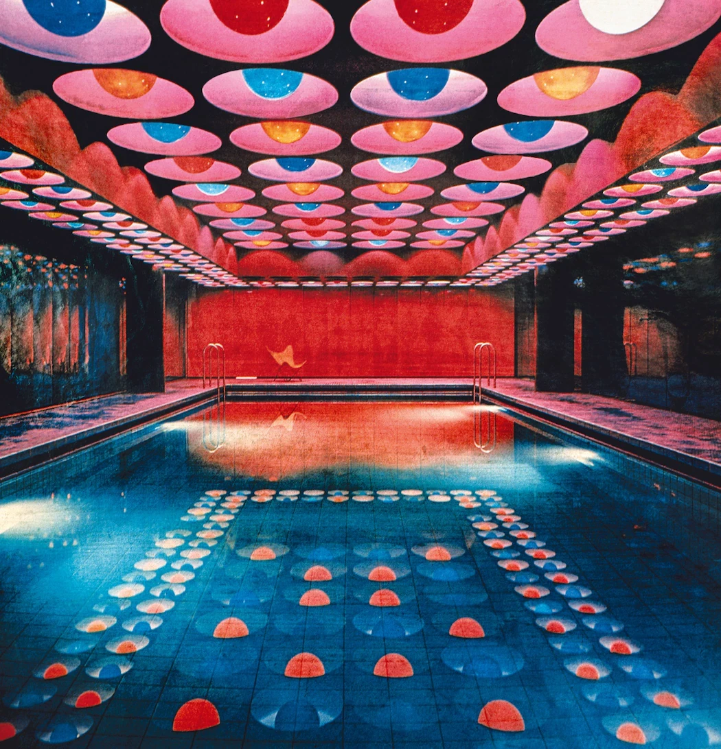
A legacy of bending the rules.
Verner Panton traded the safety of wooden legs for the thrill of cantilevered plastic. He didn't just design chairs; he designed "total environments"—psychedelic, immersive spaces where the floor became the ceiling and color dictated the mood. We took that 1960s radicalism and coded it for the 2020s.

A clear typography that speaks the brand’s language.

Minimal typography
We amplified Vitra’s existing ones: pushing weights, spacing, scale, and caps to create tension, clarity, and impact.
Social media as a sensory trigger.
Carousel
We designed a coordinated campaign of vibrant, motion-driven posts. Dynamic, bold, and consistent. Designed to amplify the message and turn engagement into votes.
Work with us
Elevate your product experience

Contact ralph


Work with us
Elevate your product experience
Contact ralph
Year
2025
Deliverables
UI/UX design 3D renders Art direction Motion Design
Vitra Panton: 100 years of Verner Panton. A digital ode to the master of color. Every pixel is placed to be functional, intuitive, and thrilling to scroll through.
Verner Panton didn’t just design furniture; he designed the future. For his centenary, we didn’t want to build a static archive. We wanted to build a digital ecosystem that felt as radical today as his cantilevered curves did in 1967.
An immersive experience where bold colors, fluid forms, and visionary design come to life.
The Experience: a journey that unfolds as you scroll
Cards
Not a catalog, but a gateway. Choose one card and you enter its world, where color defines the atmosphere and form becomes identity.
An invite to the world of Panton
Step into a dimension shaped by Verner Panton’s vision, where color leads and space follows.
Worlds
Seven immersive spaces built from Panton’s iconic curves. His fluid forms expand beyond the chair, shaping environments you don’t just view, you move through.
Scoreboard
We let the community decide the colors for the Limited Edition 2026. This isn't data collection; it's co-creation.
A flexible website that evolves with your needs.
Playful Animations
The Animation Style
Forms that flow like liquid plastic. We built transitions that feel less like loading and more like melting.
Playful Animations
Based on essential shapes, forms evolve into distinctive geometries through recombination.
The UI: a unique identity
A reflection on Panton’s language. Bold colors, fluid shapes, and modular elements create a system with a strong, recognizable identity.
The Spectrum
A reverence for red, blue, and the spaces in between. We didn't just pick colors; we calibrated a mood.
Color palette
Seven original Pantone codes define the core palette. Soft light blue and deep burgundy tones add breathing space without breaking cohesion.
A legacy of bending the rules.
Verner Panton traded the safety of wooden legs for the thrill of cantilevered plastic. He didn't just design chairs; he designed "total environments"—psychedelic, immersive spaces where the floor became the ceiling and color dictated the mood. We took that 1960s radicalism and coded it for the 2020s.
A clear typography that speaks the brand’s language.
The UI: a unique identity
A reflection on Panton’s language. Bold colors, fluid shapes, and modular elements create a system with a strong, recognizable identity.
Social media as a sensory trigger.
Carousel
We designed a coordinated campaign of vibrant, motion-driven posts. Dynamic, bold, and consistent. Designed to amplify the message and turn engagement into votes.
Work with us
Elevate your product experience
Contact ralph
Year
2025
Deliverables
UI/UX design 3D renders Art direction Motion Design
Vitra Panton: 100 years of Verner Panton. A digital ode to the master of color. Every pixel is placed to be functional, intuitive, and thrilling to scroll through.
Verner Panton didn’t just design furniture; he designed the future. For his centenary, we didn’t want to build a static archive. We wanted to build a digital ecosystem that felt as radical today as his cantilevered curves did in 1967.
An immersive experience where bold colors, fluid forms, and visionary design come to life.
The Experience: a journey that unfolds as you scroll
Cards
Not a catalog, but a gateway. Choose one card and you enter its world, where color defines the atmosphere and form becomes identity.
An invite to the world of Panton
Step into a dimension shaped by Verner Panton’s vision, where color leads and space follows.
Worlds
Seven immersive spaces built from Panton’s iconic curves. His fluid forms expand beyond the chair, shaping environments you don’t just view, you move through.
Scoreboard
We let the community decide the colors for the Limited Edition 2026. This isn't data collection; it's co-creation.
A flexible website that evolves with your needs.
Playful Animations
The Animation Style
Forms that flow like liquid plastic. We built transitions that feel less like loading and more like melting.
Playful Animations
Based on essential shapes, forms evolve into distinctive geometries through recombination.
The UI: a unique identity
A reflection on Panton’s language. Bold colors, fluid shapes, and modular elements create a system with a strong, recognizable identity.
The Spectrum
A reverence for red, blue, and the spaces in between. We didn't just pick colors; we calibrated a mood.
Color palette
Seven original Pantone codes define the core palette. Soft light blue and deep burgundy tones add breathing space without breaking cohesion.
A legacy of bending the rules.
Verner Panton traded the safety of wooden legs for the thrill of cantilevered plastic. He didn't just design chairs; he designed "total environments"—psychedelic, immersive spaces where the floor became the ceiling and color dictated the mood. We took that 1960s radicalism and coded it for the 2020s.
A clear typography that speaks the brand’s language.
Minimal typography
We amplified Vitra’s existing ones: pushing weights, spacing, scale, and caps to create tension, clarity, and impact.
Social media as a sensory trigger.
Carousel
We designed a coordinated campaign of vibrant, motion-driven posts. Dynamic, bold, and consistent. Designed to amplify the message and turn engagement into votes.
Work with us
Elevate your product experience
Contact ralph